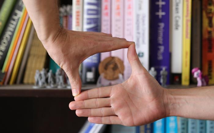
A Frame Makes it Art: Intro Videos for Streaming Shows

Remote over Zoom or in-person using a studio, our live streams can seem slap-dash next to shows with million-dollar budgets. But they don’t have to. TV solved many challenges in its hundred-year history. Using TV techniques, we too can make our art shine. Framing is the key.
Imagine you’re going to watch a show that’s live streamed. It used to be a stage show, and one of the team members learned enough OBS to put the show on Twitch. Your friend is in it and you want to support them. You go to the link 2 minutes early, but the show’s not playing yet.
There is nothing. Then there it is. The show is happening.
Next week you tune in again, because you really like your friend. You decide to tune in 15 seconds early (which takes some serious effort to get that timing right). It looks like the show has learned a thing or two. This time, there’s a “starting soon” graphic when you log in. Then the show is happening.
Well, the “starting soon” graphic was an improvement, but neither of these two starts feels very good, and you can’t place your finger on why.
It may help here to start considering what your friend’s show has taken for granted about the physical stage it used to have.
The expereince starts a lot earlier than you’d think. People would have been getting ready for this since they started driving over to the theatre. They would walk up to the building. They’d sit in a seat. They’d look at the set on the stage. They’d see a friend and say hi. They’d go get a cabernet and a bag of doritos from concessions (it’s a fancy place). Anticipation is building all the while. A million familiar habits. They love this place, they love what you do, and they love you for doing it. Then the lights would dim and they’d get really excited.
All of these sequential experiences make a frame. This frame exists in time rather than space, but it’s a frame.
Frames make stuff into art. Without a frame, it’s just stuff. If there’s no thought to the frame, the show will feel sloppy, no matter how good the performers are. A good frame however, will make even mediocre work enjoyable.
Paintings and their Space-Frames
“You know what’s the best part of this painting?” Sagot asks in Steve Martin’s Picasso at the Lapin Agile, “The frame!”
That may sound silly, and it’s played for laughs. You might even think it’s dismissive of the painter’s craft, but it’s also deeply true.
Theatre has frames in space: the proscenium, the stage, etc. But more importantly, it has frames in time. Those are hard to see, and easy to take for granted, but are vitally important to the art. Paintings simply have physical frames in space. Those are easier to see.
In both cases, the artist’s first job is to frame their subject. The second job is to use technique to further draw out what they mean for you to notice about their subject.
A painter draws attention to an aspect of life that ordinarily is jumbled-in with everything else. That’s exactly what a frame in space does. Its shape, its texture, simple or extravagant, everything about it is designed to help you see the art that it cradles. The brushwork inside is still important, but so is the frame.
A frame allows you to be selective about what you want to draw the eye. Put a frame around your subject, and now others can see it too. It’s officially art. Your technique can be refined in time, but without a frame, a boundary separating it from the every-day, it’s just an unfocused blur, and the audience won’t respect it as much more than that.
But what if you choose to not have a frame? There’s still a boundary between the wall and the edge of the canvas. “No frame” is still just one very specific type of frame, and it won’t work for every painting. The “No-Frame” frame should be a conscious choice, not the default. Art hates defaults.
TV and its Time-Frames
We keep hearing on the news how “the human attention span is decreasing”. Bullshit. The human attention span is epic and always has been. It’s our always-on technology pouring down distractions, interruptions and notifications in a neverending torrent that make it appear that humans don’t have attention spans anymore. However, a human does need to warm up to have a chance to focus.

I grew up watching TV. When I was a kid, if a TV was on, even if I was just passing by it, I would get glued to it, staring, unblinking, slack-jawed. There’s a reason they called it “The Idiot Box.” I could watch TV all morning on Saturdays starting at 6am and still be wanting more when sports came on at noon. TV knew how to hook its audience, and it does so in three ways:
- Sound Design – (Not discussed here)
- Editing – (Also not discussed here)
- Framing – Framing in particular keeps you coming back.
Think of you favorite TV show. I guarantee you remember its intro and especially its theme song. Just that alone makes you smile, and it gets you ready for what you’re about to see. Even if the TV show itself isn’t that good, just watching the intro will put you in a good mood, and positively bias you as you watch the show. Is that manipulative? Yes. But as long as the manipulation is done purely for audience enjoyment rather than thought control, it’s desirable.
Side Rant:
Video manipulation for the purpose of thought control is not only possible, it is effective. It is also never permissible for an artist to do this. Consent can’t be granted when the input short circuits consciousness. Sadly, nearly every social media platform, and their advertising content seek to do exactly this for the benefit of the platform and the advertisers. Watch social media with extreme care. Never consciously create this kind of manipulative video content, and always seek to remove unintentional manipulation from your own streaming video art.
To further cement the good feelings, the same song from the intro, or a close variant, plays in the ending credits. Human beings remember the beginnings and endings of things well, so even if there are bits in the middle that weren’t that good, even if the entire show is just awful (there are Star Trek episodes that are like this), you still feel like the show wasn’t all that bad because of the frame created by the intro and the credits.
And because that intro is repeated each time you see a show, you start to associate it with the art, the artists, and how they make you feel. It starts generating anticipation, familiarity, and relationship. And it’s so inexpensive as a technique. Shaking every audience member’s hand and thanking them personally isn’t as effective as a good intro. And takes waaay more time.
That’s what time-framing can do. The show is made better when it’s temporally framed by its intro and credits.
Yeah, But…
Still not sold? Sounds stupid? Think it disrespects the intelligence of the audience? It doesn’t. It respects their support of your art. Try an experiment.
Watch a decent TV show without the intro or the credits.
- Don’t use the “skip Intro” button; just pause it after the intro.
- Walk away, go clean the kitchen or something.
- Come back to watch the show from where you paused.
- Don’t play the credits either. Just stop when it’s over.
You won’t like the show as much. You may even get distracted before the show ends. The frame helps you focus.
If you make intros and credits for your show, it will make your work much more watchable. Your art deserves to be treated right. Put it in a frame. Your audience needs to be respected. Give them a frame to remember you by.
If you really do chose “no frame”, be clearly intentional with it. The reason to choose “no frame” should be that no other frame will work better, not “I didn’t have time.” or “We forgot to consider framing”. Respect your art enough to be intentional about framing it.
How to make a Frame
-
Watch a bunch to TV show intros to get a few ideas on how you might cut yours together.
- Just make sure to watch a variety so you don’t accidentally duplicate the opening to Twin Peaks or something.
- If you duplicate something, be intentional about it.
- Make sure it’s within the bounds of what’s permissible under copyright and intellectual property law. You’ll want your intro to be your own intellectual property, anyway.
-
Make sure you have permission for any sounds or images you did not record and edit yourself.
- Material in the public domain, and under CC0 licenses will be the easiest to work with.
- But be careful! Free stock sound and images can become cliche and uninspiring, which is not what you want your audience to experience over and over for your shows. Be judicious in using stock material.
- Prefer your own recordings whenever possible.
-
Start with music. Music is the foundation of all of this.
- If you’re just getting started, you can achieve pretty good results using Garageband, but for finer grained control, use a professional DAW like Abeton. It will take some focus to learn, but you can get on your feet quickly, then learn as you go.
- You could even write a song with lyrics! An example is “Princes of the Universe”, which Queen wrote for Highlander. Any choice you make, any style, any lyrics is going to need to be custom to your show. Not every show needs a Queen cover, but it’s an example of how this might work.
- The song should be about the length of the intro, between 30 seconds and 1 minute. If you’ve got a cast larger than 6, you’ll probably want a song more on the order of 45 seconds.
- The sound and feel of what you choose is going to set the mood for the show. It’ll even influence how the cast performs, so make sure it’s the right mood. Never just pick some default for this, you’ll end up railroading yourself into a show that isn’t yours anymore.
-
Gather any additional soundscape elements that you might use.
- Sounds, such as owl hoots, or a gunshot, for example. Oftentimes music is enough, but these are options too.
- Same thing goes with any voiceover elements. Record those and keep them for the next step.
-
Watch a bunch to TV show intros again this time looking at the kinds of shots, images, and graphics they use.
-
Put together a shot list (sometimes this is more like a wishlist)
- Six or seven items on the list might do, as a starting place. These shots are often artistic “B-Roll” that help set the mood.
- Establishing exterior shots setting the stage of where events are happening.
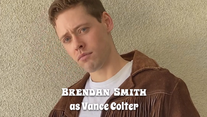
- If the cast is going to be introduced visually, you’ll need a 3 to 5 second video of each regular cast member.
-
Go out one weekend on a scavenger hunt to get as much of those shots as you can with any cameras or phones you have.
- The shots should each be 15 to 30 seconds long so you have some room to cut them into the finished product.
- The whole cast can get involved and make a picnic out of this.
- Look for compositions that are not what you normally see on Zoom. Anything other than a medium-closeup will be a welcome relief to your audience’s eyeballs.
- And keep an eye out for stuff you don’t want in the shot. A pickup truck driving through your “Space Opera in a far away Galaxy” intro is definitely going to distract your audience.
- Don’t be afraid to record unexpected stuff you find on your scavenger hunt as well.
- Don’t worry if it doesn’t go exactly to plan so long as you get enough shots to work with.
- Gather these video shots together with your sound clips and theme song.

-
Watch a bunch to TV show intros one more time to review how you might cut your shots together.
-
Cut it all together in a video editor like Davinci Resolve.
- Start by laying down the music track, and any soundscape and Voiceover elements. At this point, even with just a black screen, it should start feeling right.
- As an option, put down a main opening and closing B-Roll or Establishing Video. This video frames the intro. It’s the first and last thing you see. You can change this if you like something else, but it’s a good starting place.
- Make sure the closing has enough time to show Director, OBS Operators, and Design credits.
- Then fill in the middle with any cast videos. The music helps here. Edit it to the time of the music.
- Then fill in the rest with whatever feels right.
- Do any color grading or post-processing to sweeten the look and make it one seamless whole.
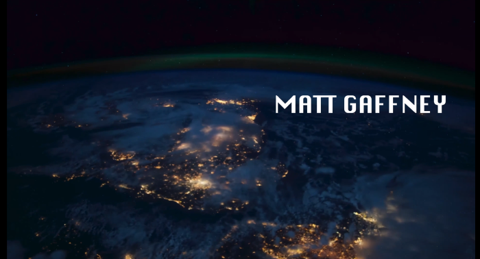
- Finally, add in the titles and credits.
You’ve got an Intro Video!
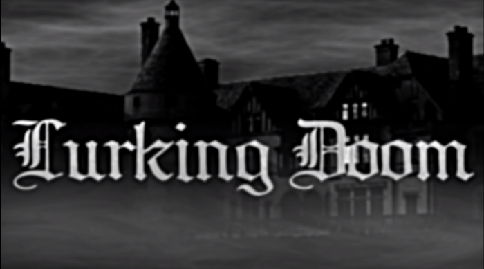
Now go ahead and use some or all of those same elements for the closing credits.
As a guideline, the closing credits usually are a little less snazzy than the opening, and there’s nothing in the credits that wasn’t in the Intro Video. The titles might roll instead of fade in and out. Maybe there’s no soundscape, or it’s missing the lead singer lyrics. Almost certainly, there’ll be no voiceover. Maybe it’s shorter, 30 seconds instead of 45. Maybe there are still photos in a slideshow instead of full videos. And you can break those guidelines too, if it works for your show. It all depends on the effect you’re going for.
The point is it gives the audience a moment to gracefully get up, appreciate your work, see your names once more, then shift their focus…
While they also get your theme song stuck in their heads!
Going further with Frames
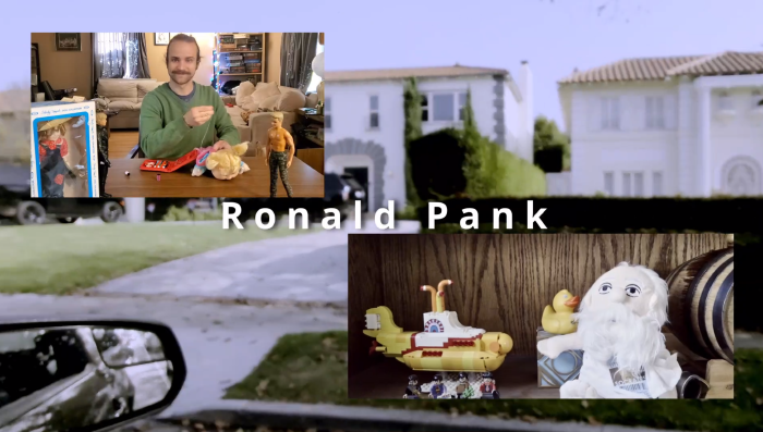
You can go further with this. Maybe you want an opening stinger, that’s only 5 seconds long to frame the “Get”, when an improviser asks the audience for a suggestion, then roll the full Intro Video to frame the show itself.
Maybe you want transition videos between scenes that remind the audience that they’re watching your show and give their eyes a break from your live feed.
Maybe you want hype videos interlaced into the Lobby start and ending cards. The possibilities abound for ways to frame your art, and get your audience excited for the experience.
If you want your audience to feel good about your show, the best way is to tell them to feel good about your show. Temporal framing is a powerful tool to help with this. Now go out and make some awesome art!

